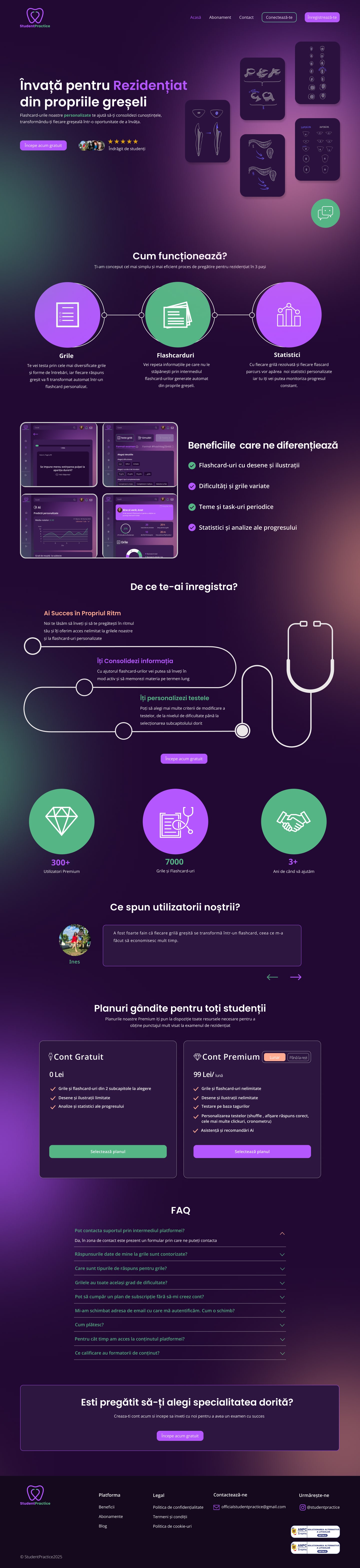
I was tasked with redesigning the StudentPractice platform, an educational tool that supports medical students in exam preparation through interactive quizzes and educational resources. The client approached me with the goal of redesigning their outdated website to align with the evolving needs of their users, primarily young , ambitious students aged 20-26, while also creating a modern and cohesive brand identity. Goals and requierments: 1. Redesign the website with a dark mode interface to reduce eye strain and provide a sleek, modern feel. 2. Improve user experience with clear structure, easy navigation, and focused user flows. 3. Enhance UI consistency and visual appeal across all sections with calming colors, clean typography and better hierarchy. 4. Create new logo that reflects the platform's purpose: helping medical students grow, succeed at the exam , and feel supported on their journey. 5. Ensure mobile responsivness and clarity across all devices. Research and insights: I reviewed the old website and I analyzed available usage statistics to understand how users were interacting with the platform, This helped highlight both behavioral patterns and pain points that needed addressing in the redesign. Some key insights: Users often study late at night and preferred darker interfaces. They wanted faster access to quizzes and study materials. Visual clarity and emotional calm were essential to reduce stress. This insights helped shape both the UX decisions and the mood fot the visual identity. Design Process: I started with low-fidelity wireframes to reorganize the content structure and improve clarity of navigation. I focused on quiz accessibility, dashboard hierarchy and navigation logic. Once the structure was finalized, I moved into high-fidelity UI design with focus on clarity, minimalism. The dark mode and color palette were chosen carefully to reduce visual fatigue during long study sessions and to create a calm and focused environment and to appeal to the platform's young audience. Used typography that's legible and calming. I added icons and visual cues for a friendlier feel. Final thoughts: Redesigning StudentPractice was a rewarding experience that combined strategic UX thinking with thoughtful visual design. The challenge of creating a calm, focused, and accessible learning environment pushed me to consider both the emotional and practical needs of users ( medical students) navigating high-pressure situations. What stood out most was the importance of designing with empathy. My goal was to create a space that felt clear, focused and easy to use. The new design not only modernizes the platform but also aligns closely with the needs of its users.
visit live site →